The Well Tempered Color
Acrylic on paper. Thread.
2025
This project starts from my background as a pianist and my interest in the relationship between color and music. I grew up listening to Bach as my father is deeply fond of his compositions. Last year I began studying and playing Prelude No. 2 from The Well-Tempered Clavier on the piano.
As I engaged with the piece, I started to sense a strong connection between the structure of The Well-Tempered Clavier and the way color functions. This realization led me to dive into research on the relationship between music and color. I explored the writings of Johannes Itten, Ramsay Hay, George Field, and other theorists and artists who have examined this intersection.
Inspired by Bach’s well-tempered system, where every key is equally spaced in semitones, I developed a parallel structure in color: each tonality is represented by a hue, forming a chromatic harmony that mirrors the musical one.
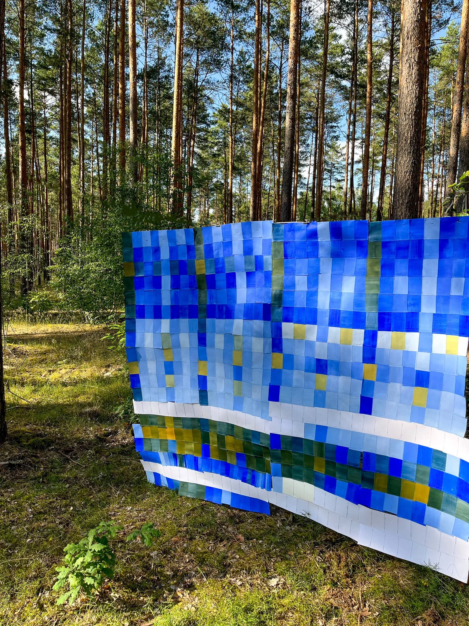
The work you see here is based on Prelude No. 2 in C minor. Its entire palette was created from just four colors: ultramarine blue, pyrrole red, cadmium yellow, and white.
With this work, I aim to create a visual bridge between music and color, sound and painting; a space where one art form translates into another, inviting the viewer to see music with a different color.
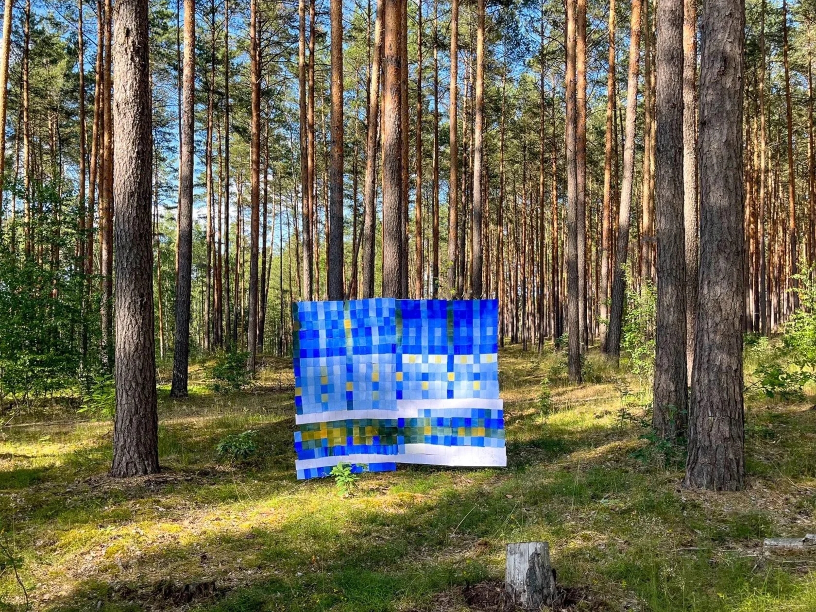
Prelude n2 in C m. Acrylic on paper and thread, 230x260cm, 2025.

Prelude n2 in C m. Acrylic on paper and thread, 230x260cm, 2025.
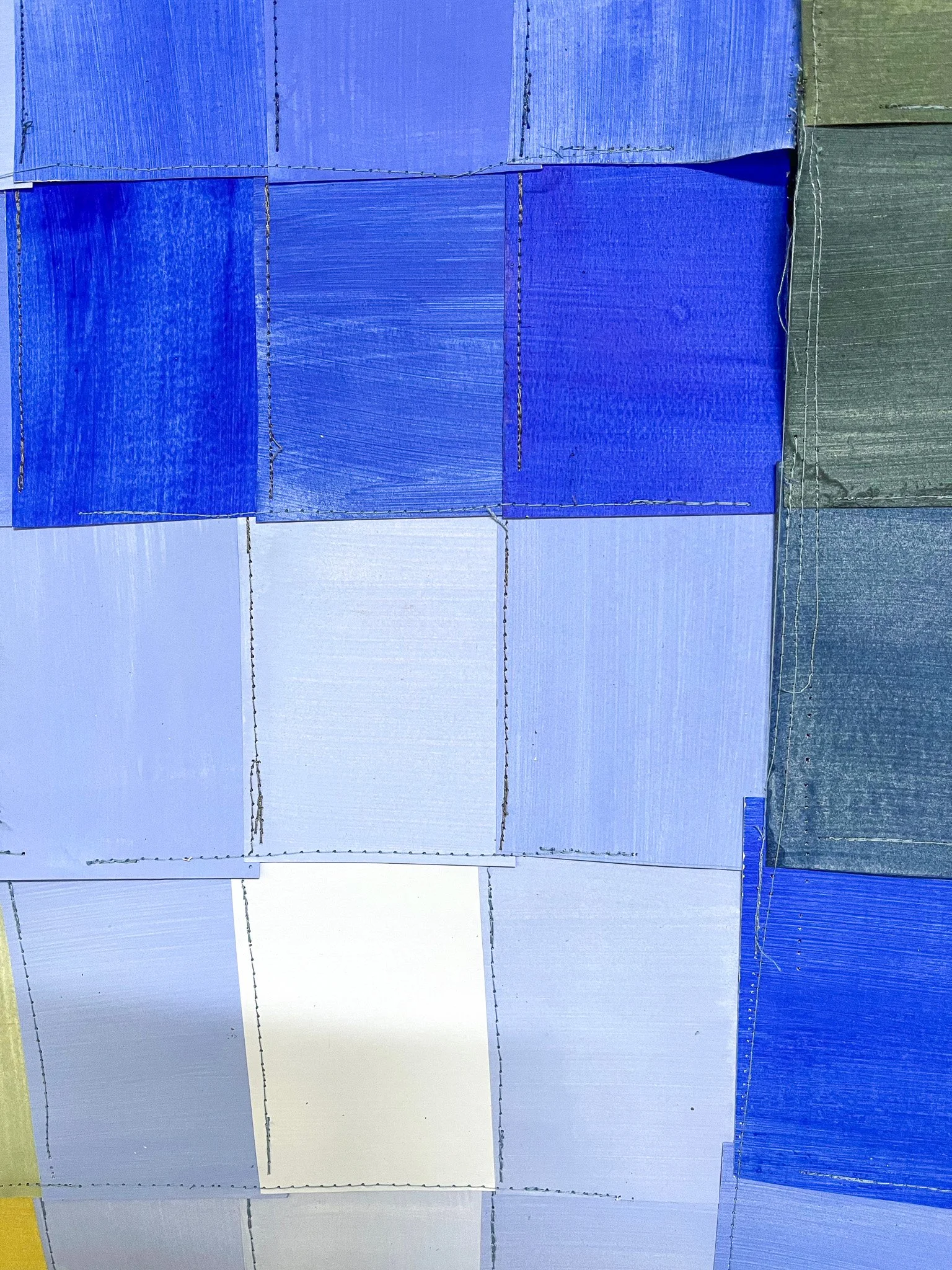
Detail Prelude n2 in C m.
Detail Prelude n2 in C m.